Gardner White Center — Rebranding GW Clearance Center
Giving a new identity to Gardner White's Clearance Center section
Project Goals
A project for Gardner White, Michigan's biggest furniture retailer. We were tasked with giving an identity to their Clearance Center.
Project roles
As the designer and team lead during the design phase, I helped clarify design decisions to inform design cohesion.
Collaborators
Reese Mallon
Jack Bennett
Niclas Mueller
Process
Research
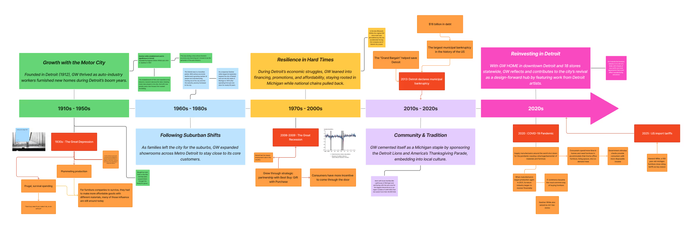
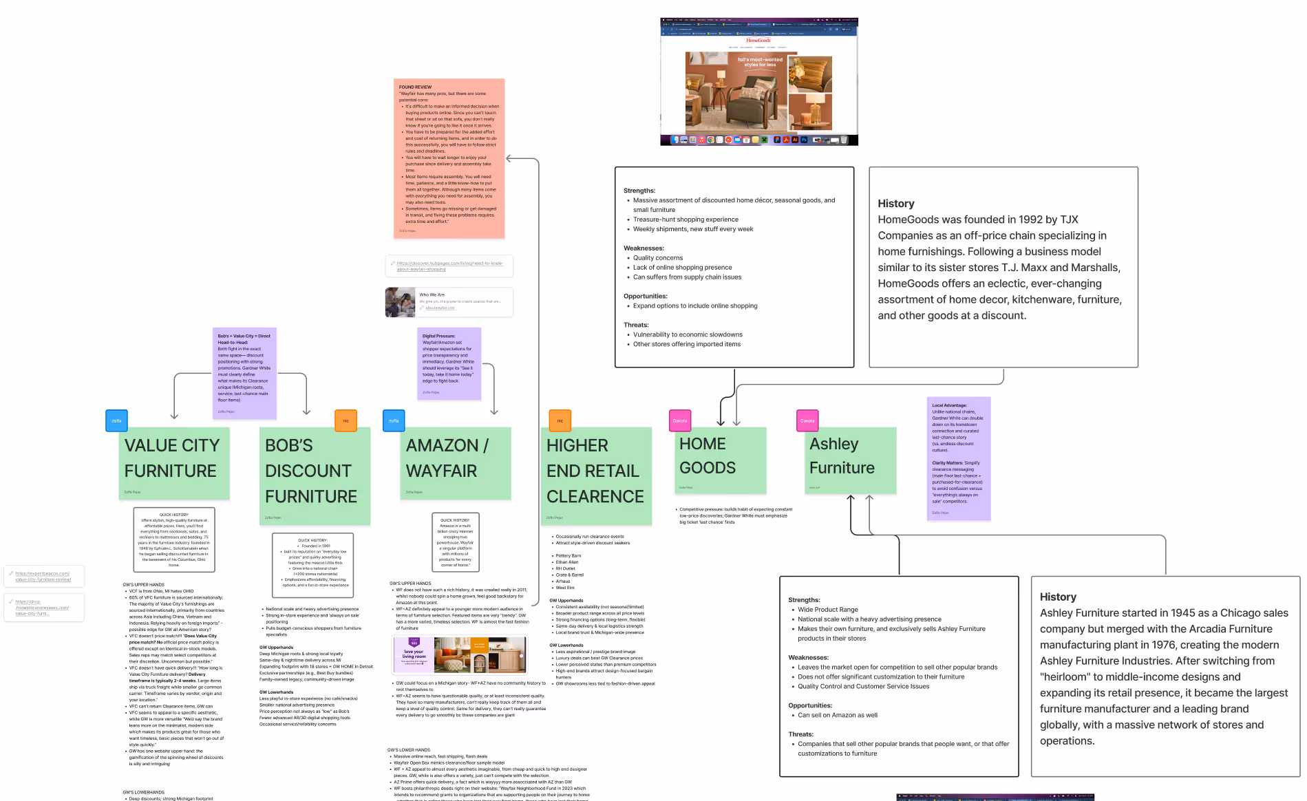
We started with understanding Gardner White's position. To do so, we took a deep dive into GW's history and how it fares up against competitors.
Visual & Language Development
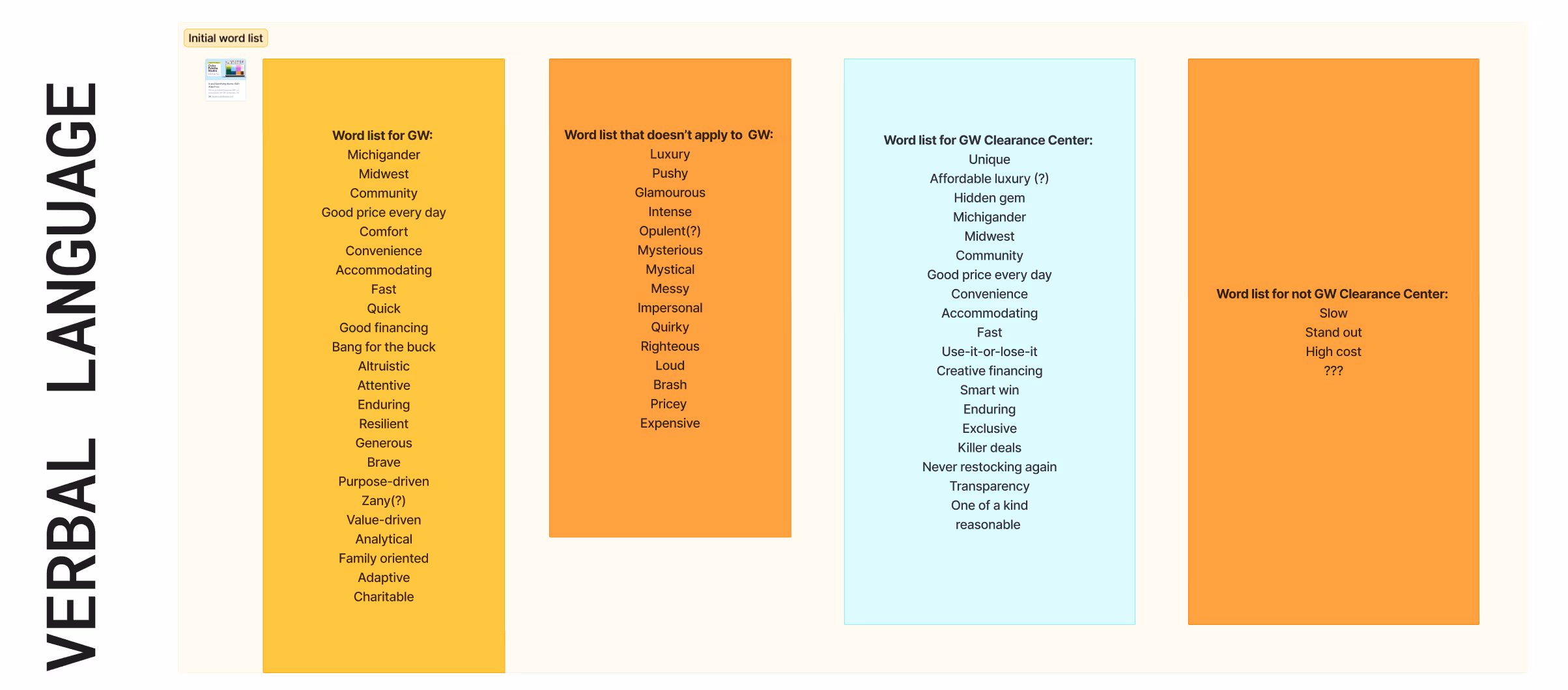
After receiving feedbacks for our positioning, we gathered the insights and continued with developing concepts for the Clearance Center's identity.
Explorations
As we flesh out a direction, we took inspiration from all things Michigan: the Great Lakes, the Detroit spirit, the familial vibes that only a Midwesterner can bring. These all became crucial parts for our identity.
With these elements, we were able to explore many different directions for the identity.
Design
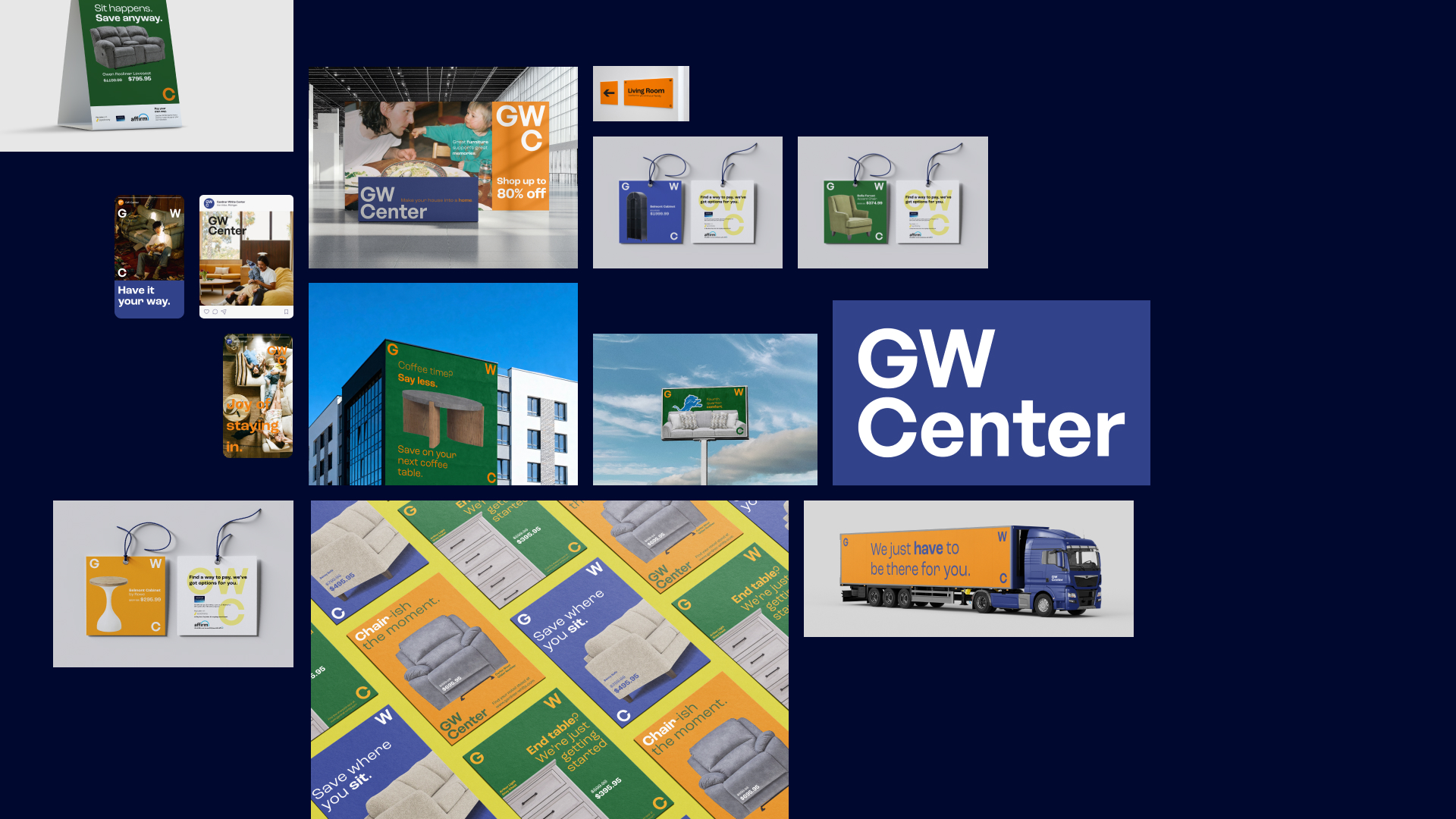
Combining feedback, R&D and insights from iterations, we came up with our final direction: Gardner White Clearance. GWC is a place of discovery, family and choice. We think of GWC as a place of celebration with hard-to-beat finds. It's a place of joy for those seeking to furnish their homes with accommodating deals and unique pieces that they won't find anywhere else. It's a place of fun, as clearance has always been about that treasure hunt spirit.


Reflection
Consistent Communication
This project had a lot of moving parts, so communication was crucial to our success. We met frequently as teammates, sought feedbacks from stakeholders and iterated to make sure our deliverables were on point.